The project: refresh a gray-on-gray-on-gray guest room with a design inspired by the Mary Poppins movie. The room will have a welcoming English country inspired feel, full of florals and patterns. Through thoughtfully selected decor, I’m adding lots of hints that Mary Poppins may have once stayed here while having a glorious day. Perhaps just like she did with Bert and the children when they popped through that sidewalk picture.
You can read the full inspiration story and have a peek at the mood board and color palette here. [link]
The Mary Poppins bedroom is starting to come together! The paint color that I selected for the walls looks great! The new crown moldings and baseboards look amazing. And I’ve found so many awesome accessories to really add that Poppins twist to the room.
And yet…
Needing a Spoonful of Sugar to get ‘er done
As I’m writing this post, I’ve hit the point in the project. You know the one. The one where you start asking “what in the heck did I get myself into?” I’m just ready for it to be done. In fairness, this room is a cakewalk compared to some of the other home renovation projects we’ve taken on in the last 18 months.
But every project has that point where you:
- Start making shortcuts so you can get the thing finished
- Throw the budget out the window so you can get the thing finished
- Both
I have to admit, I’ve done a little of both.
I really wanted to paint the ceiling a color in this room instead of leaving it white. But that was when I anticipated that the walls were going to be an off white.
Five thousand white paint samples later, I decided to go with a pretty sage green on the walls. I was afraid of white looking a little too stark with the gray carpet, even a nice off-white. A Poppins room needs to be welcoming like a spot of tea, not dreary like the inside of a chimney in London, right?
With the green walls, a green ceiling just felt a bit too much. I contemplated a nice blue to mimic the sky, and I still might try it someday. However I (my neck) don’t looove painting ceilings. It wasn’t painting the ceiling the one time that killed it for me. It was the thought of painting it again if I didn’t like it that killed it.
After doing all of the trim work and painting the walls and moldings, I just didn’t have it in me. And I want to get this done.
Shortcut taken.
About the green walls
The color I wound up choosing for the walls is Sherwin Williams Clary Sage, and it’s amazing. It’s just the right amount of green without going into the green-yellow realm of things. It’s definitely a color that would fit right in many homes today with all the different neutrals that are popular (gray, beige, off-white).
I was worried about how well a green would play with the gray carpet – replacing the newer carpet was definitely not in the budget. No regrets at all. It looks great.
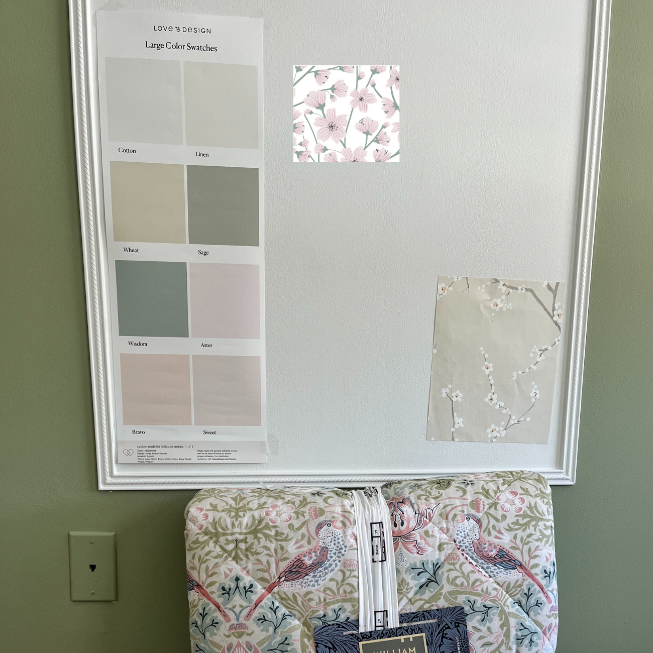
Here are all of the different greens that were sampled. I’m really pleased with the selection and how it looks in the room.
Clary Sage – top right – is a medium toned, soft green paint. It’s part of the Neutrals collection for Sherwin Williams. There’s a decent dose of gray which softens the green, but there’s no mistaking that this is a green when you put it on your walls. It’s just perfect for this room.
Be sure to sample any paint color before painting. Various factors can influence how a paint color will look in your specific setting.
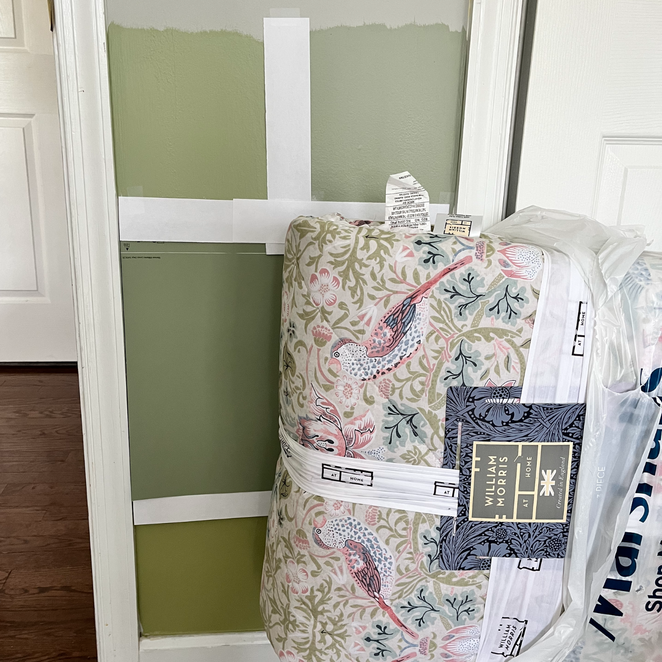
Bringing Cherry Tree Lane to life, or WTH to put inside the picture frame moldings
The other big sticking point for this project has been the wall treatment in the three panels on the feature wall. I found wall decals of cherry tree branches and blossoms that I thought would look great. And they were budget friendly, which was fortunate because budget creep is already setting in.
But once I started applying the decals, they just didn’t look…nice. Sigh. You could see the film outline around every blossom and branch. It just looked kinda cheap. I contemplated spending hours with a pair of scissors trimming them down. But even this Disney princess has her limitations.
Next I tried hot-gluing cherry blossom flower heads from Micheals’ (basically the flowers without the branches) onto the walls for a 3-dimensional effect. I got about 6 flowers in and stopped – just wasn’t feeling it. Didn’t love the look, and it would take about 300 blooms and lot of re-arranging to get the desired effect. That’s a lot of hot glue.
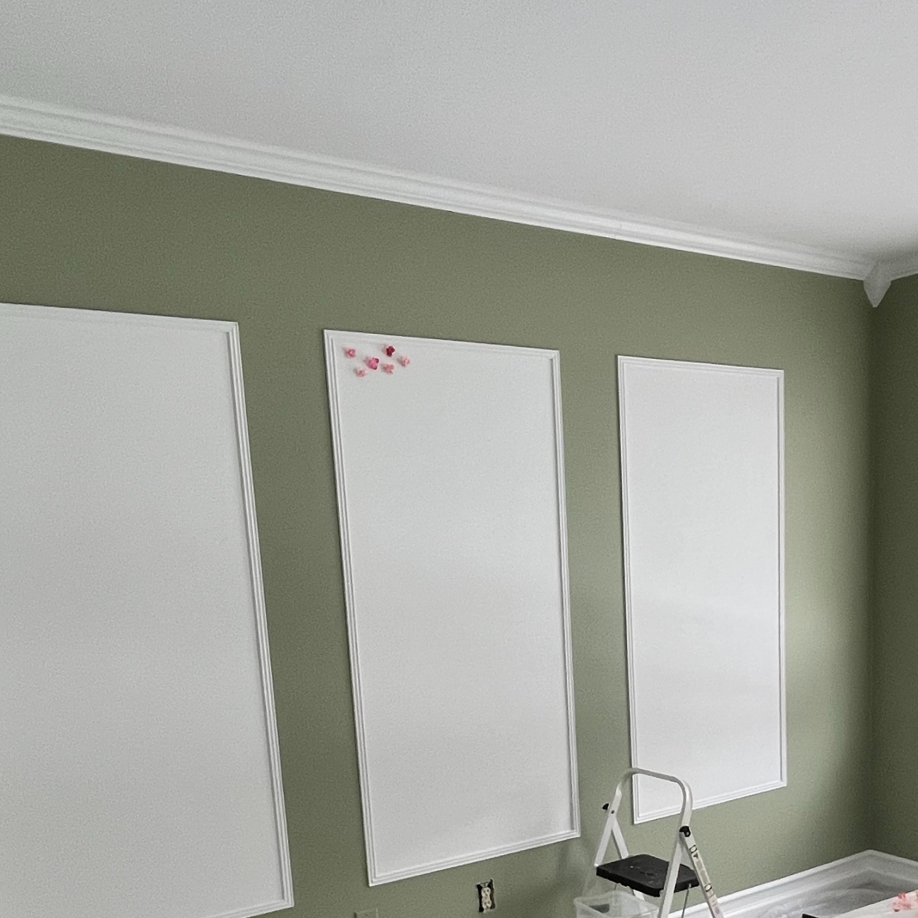
With wall decals I don’t want to use (and can’t return) and a heap of cherry blossom flower heads on my hands, these framed panels are becoming a money pit and time suck. Here I am thinking they were going to be a main focal point of the room.
So now what?
I’ve painted myself into a bit of a corner (haha) by going with the sage green on the walls. Plus the picture frame molding is on the wall. I REALLY want the cherry blossom look for those panels but options are limited in terms of what I can find that will work with the sage green.
Budget, what budget?
Refusing to give up (hubby says stubborn), I found samples for two options that might work. I’m S.O.L. if they don’t.
One is a standard peel and stick wallpaper, which will keep the budget looking better. The other is a custom-colored wallpaper from a company I found called Love & Design. You can choose one of their wallpaper designs, then choose the colors you want to use for the wallpaper. I totally love this idea, but it’s almost 3X the cost of an “off the shelf” peel and stick.
Here are the samples below. I’ve also added a screen shot of the Love & Design pattern for reference:
I’m not sure yet which way to go, the samples literally arrived today. But I’ll save the decision for the big reveal in my next post 🙂
Crown, picture frame, and baseboard moldings (or would Mary Poppins say mouldings??)
These enhancements turned out so nice! And they were not that hard to do. A few reasons for that:
- I have a great little power saw that I purchased a few months ago to install a LVP floor in our laundry room. It makes the cuts super easy. It’s a Ryobi flooring saw from Home Depot. It’s the best thing ever for small projects like this. Lightweight, portable, easy to use.
- The crown moldings are made of polystyrene, which makes them very light weight. They were light and manageable enough that I could install without a second pair of hands. No power brad nailer needed, just a hammer and finishing nails did the job.
- This is a square room (no funky corners) and I used corner blocks with the crown molding. That way there were no miter cuts needed, just straight cuts. So. Much. Easier.
- Miter cuts were needed for the floor molding and angle cuts for the picture frame moldings. The Ryobi saw was perfect for the job since those pieces are smaller in size.
I really love how the baseboards look so much beefier with this simple trick. A small piece of molding placed a few inches above the existing molding, then paint the whole thing white, and voila! Using a piece of scrap wood to mark where to install the new trim simplified the process. It took out the guesswork and hours with a level in placing the trim pieces on the wall.
[Picture of painted room with trimwork]
[Close up picture of baseboards]
Just keep swimming looking
I’m mixing Disney movie quotes, but it’s an important point. One thing I’ve learned throughout this process is if you can’t find what you want, don’t give up! Keep looking! With a specific theme like Mary Poppins, the perfect [fill in any item here] is not always easy to find.
Finding the right stuff is daunting, even with the likes of Amazon, Wayfair, etc. at your fingertips. This aspect was particularly challenging with this room. The colors, the furniture, the accessories are all about creating a very unique theme and feel for the room.
I was about to give up a few times with the ceiling fixture for the room, the whole wallpaper drama described above (which was also a challenge during the planning phase), and the bedding. The way forward was:
- Changing up search terms
- Looking at alternative websites and retailers
- Letting go of some of what I thought I wanted from the planning stage
These steps eventually enabled me to find some really cool things for this room.
I can’t wait to share it all with you soon!
Read the other articles in this series: