Have you had the chance to experience the Guardians of the Galaxy Cosmic Rewind ride at Walt Disney World? Do you miss it when you’re at home? Or maybe you’re a fan of the movies and want to bring Guardians of the Galaxy decor into your home. With a bold color palette and decorating tips that draw inspiration from the amazing attraction, this post will help you do just that.
But first, the ride.
Guardians of the Galaxy Cosmic Rewind – Just WOW
Since 1998, when I first rode Tower of Terror, it was hands down my #1 favorite attraction at Walt Disney World. To me, it alone was worth the price of admission. That is until just a few months ago when my two daughters and I experienced Guardians of the Galaxy Cosmic Rewind in Epcot for the first time. OMG, greatest roller coaster ever!
We (I) went broke buying individual lightning lane passes. Worth it. We got in the virtual queue as many times as allowed so we could ride over and over. The music, the lights, the spinning…and the seats are even comfy!
I know for some that this attraction is a non-starter due to motion sickness issues. Fortunately for the three of us that’s not a thing (phew!).
My youngest had her sweet 16 this fall, and I tried to convince her to do a one-day trip to the World – we live outside Philly mind you – just to ride Guardians to celebrate. We almost had it figured out. However things like school and my husband’s glare (you want to do what?) conspired against us. Sigh.
Where were we? Oh yes, back to the decor.
Guardians of the Galaxy decor – not a whole house effort
As I was going through my photos from the trip, I was trying to imagine how or where to work in Guardians of the Galaxy Cosmic Rewind decor at home. As cool as the attraction is, with its bold, dark colors and strong geometric shapes, it’s probably not something that most of us would want throughout our home, or even in any of the primary living spaces.
To my knowledge, post-blip multiverse chic is not a very popular design aesthetic right now. Although, I do think it could be really cool for a finished basement, a media room or even a kids bedroom.
As you’ll see below, all of the colors that we’re working with in this palette are very bold. I’ve included eight paint colors total, however I would not recommend trying to use every single color in one room.
If you want to create a Guardians of the Galaxy theme in a room in your home, pick 3-4 colors to work with. You can use these for an accent wall, artwork, throw pillows, and throws, all against a neutral background.
For your neutral background, you don’t want to be throwing those colors against white or even off-white. It could look too stark. A light or light-medium depth color backdrop – for walls, large furniture pieces, etc. – would work best. Think cool and warm grays, greiges, taupes and neutral beiges.
Color palette for Guardians of the Galaxy room decor
A note about the color choices: If you start to go down the path of bringing Guardians of the Galaxy decor to a room in your home, use these colors as guidelines. They are not some hard and fast list for this design. They are a guide for you to visualize the colors that make up the palette and how they relate to each other and your existing finishes in your home. You may find a similar shade that’s a bit darker, lighter, more purple that seems to go better with your existing sofa or lighting situation. In that case, always go with what works best for your room.
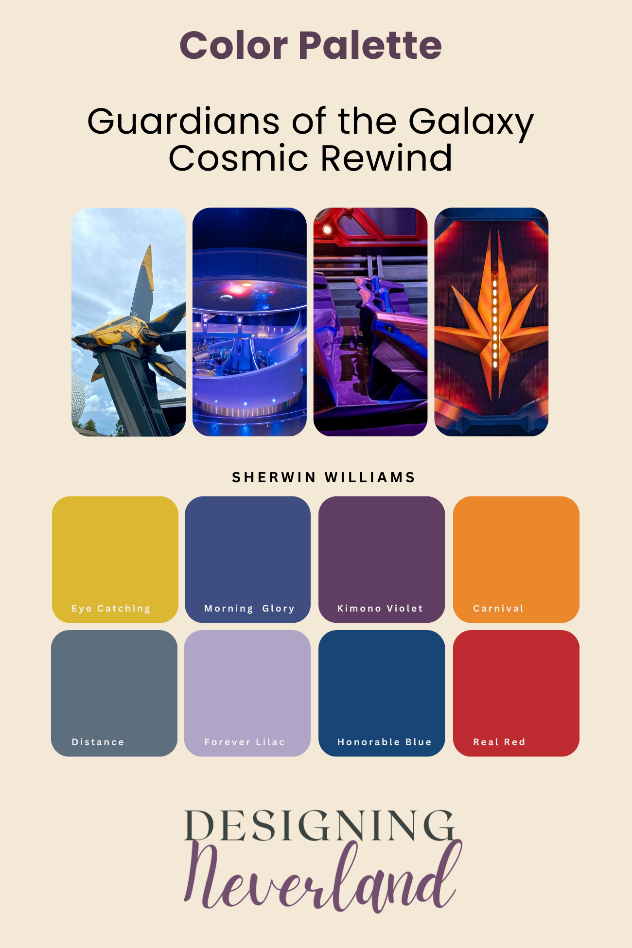
Sherwin Williams Eye-Catching
Sherwin Williams Eye-Catching is a light-medium yellow paint color with a green undertone. It’s not one of the main colors that you’ll find at Guardians of the Galaxy Cosmic Rewind – it’s most notable location is just outside the attraction on the Benetar (I think that’s the ship’s name?). But it’s a fun accent color to introduce in decor like pillows, picture frames, lamps and throws.
Sherwin Williams Carnival
Sherwin Williams Carnival is a medium depth orange paint color. Again, this is not one of the main colors found in the attraction – its an accent on ride vehicles. But it complements the dark blue and purple colors that make up the majority of this theming quite nicely.
Sherwin Williams Real Red
Another accent color for the palette, Sherwin Williams Read Red is a medium-dark paint color. It’s often a popular choice for front doors. It’s a very nice red as it doesn’t pull too orange or too purple.
Sherwin Williams Distance
Now we’re getting into some of the more dominant colors of the attraction. Sherwin Williams Distance is a medium-dark blue with a gray undertone. You’ll find this color on the same color strip as Sherwin Williams 2024 color of the year, Upward. If you’re bold enough to try out the color-drenching trend that’s popular right now – walls, ceiling, trim, doors all the same color, primarily using deep tones – Distance would be my pick of the palette for your Galaxy-themed room.
Sherwin Williams Morning Glory
Sherwin Williams Morning Glory is a legit dark paint color. If you don’t have adequate lighting there are times that it could look like a purply-black on your walls. With good light, this is a really nice deep purple color. I like this color for an accent wall a piece of furniture like a bookcase.
Sherwin Williams Honorable Blue
Another dark depth paint color, Sherwin Williams Honorable Blue is a deep periwinkle color. Depending on your lighting situation, this color will look very blue or could look quite purple (technically, it’s considered part of the purple color category by Sherwin Williams). Honorable Blue is another great choice for a feature wall or painted furniture piece.
Sherwin Williams Forever Lilac
This is such a nice purple color and it’s a huge part of the queue for the Guardians attraction. Sherwin Williams Forever Lilac is a medium depth paint, but at the high end of that spectrum. It’s lighter depth and cool, balanced color compared to the darker blues and purples in the palette provides a nice contrast. I would stick with this color mainly for accent décor pieces.
Sherwin Williams Kimono Violet
If you’re feeling really bold about your Guardians of the Galaxy themed room, try Sherwin Williams Kimono Violet for a feature wall. This is a dark color with a decent dose of red in its color. Even in low light situations, this violet will never be confused with blue. It looks awesome with warm gray colors, so it could be a choice if you’re already working with that in your room.
A Few Words About Sampling Colors
Whenever you’re shopping for decor or wondering which colors to use on the walls, you should always have color samples on hand so you can make the best decisions. Even if you’re not using a color for the wall, a color sample is super useful to get the colors just right. It’s easy enough to grab free paint chips from your local paint store, but if you’re considering painting the walls, then you definitely need larger samples that you can see in your room with your specific lighting.
Sampling paint on the walls used to mean not so cheap sample pots from the paint store that you then had to paint and wait to dry at home in several areas of your room to get it just right. These days, all you need to do is head to Samplize.com where you can order your color, and in most cases, have it on your doorstep the next day. The samples are made from real paint and are peel and stick, so you can move them around your room and up against furniture, décor, etc as needed. I have to admit, after renovating our entire first floor last year, I’m a bit of a Samplize junkie!
Order your Samplize Peel & Stick Paint Samples Here
And what if you’re shopping online? That makes things a bit trickier, because colors can vary based on photography, computer screens, etc. The best way to see if the items you’re looking at online will coordinate is to create a mood board.
A mood board is simply a document where you can collect all of your elements (paint colors, décor, etc) for a visual reference to see if all the pieces work together. You can use something as simple as Microsoft Word or even Excel. Ideally, I recommend either a blank PowerPoint slide or the free version of Canva, so that you can easily move your images around on the page.
To get started, copy the color palette image from this blog post for color reference. Then start pasting in images of the various décor pieces you’re considering. Add and delete items as you pull the room together. It does not need to be fancy or take much time at all!
You may still wind up returning a few items that just don’t work, but that’s the world of online shopping! Taking the time to put together a mood board helps prevent some of the usual headaches of click and buy.
You’ll see a sample mood board for Guardians of the Galaxy décor further down in this post.
Finding inspiration for Guardians of the Galaxy home decor
I had a ton of fun searching online for different pieces to bring the Guardians feel into a room. There are so many different design elements to inspire a room’s design. Of course there’s the whole other-worldly, futuristic vibe of the ride and the movies.
Part of what makes Guardians so fun are the retro elements like the music, so that its all not too serious and cold. Who doesn’t love a good mix tape?
Shapes are also an easily replicated influence. Examples are the hexagons found all over the walls and floors in the queue, and the “star” shape of Benetar.
Then of course there are all the colors, which have been discussed above. And the notion of traveling through space, with planets, stars, and galaxies providing plenty of decor inspiration.
A “cosmic” mood board
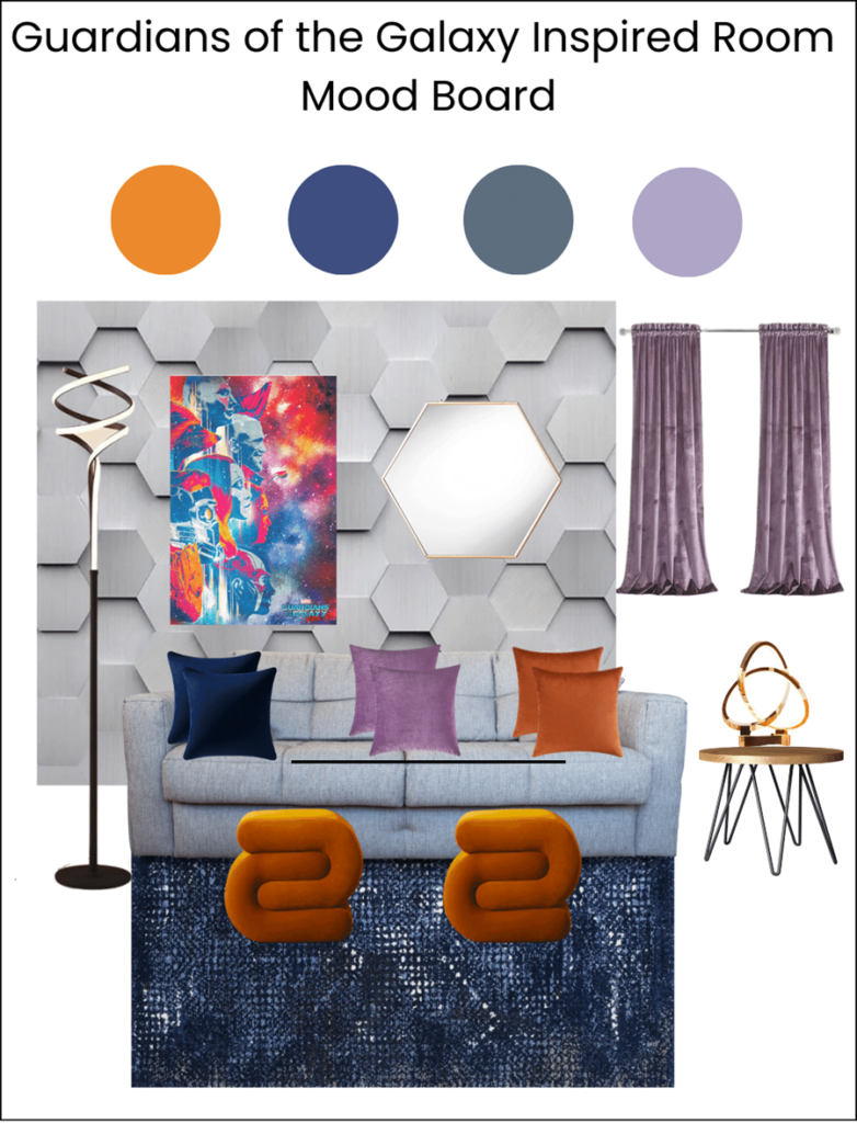
It didn’t take long at all to find some fun decor for a finished basement. Searches for “futuristic lamp,” “lavender area rug,” “hexagon mirror,” and “Guardians of the Galaxy art print” yielded tons of results. Many items were super reasonable in price. And of course you can always spend more if you’re so inclined :-).
I looove the funky orange ottomans and the space dyed looking area rug. So fun. And there are so many cool-looking LED lights available that really make a statement. The artwork I found on Etsy. They also had some fun mix tape artwork too.
And the hexagon pattern in the background, believe it or not, is wallpaper. Customer comments all remark how it totally looks 3-D in person.
Would you try a Guardians of the Galaxy decor style and theme in your home? Where? If you have already, do share!